Project Overview
The product:
STBE (Save the Bonelli’s Eagle) is a non-profit organisation based in northern Spain, fighting to prevent the extinction of the Bonelli’s Eagle. The current website has become obsolete and we have been asked to redesign it, as well as to create an app to capture as many donations as possible and to allow donors to track their donation and the project through personalised alerts. All this in order to make the project grow and help the Bonelli’s eagle to increase its decimated population
Project duration:
During May 2021
The problem:
Business: Currently, the STBE website is not receiving enough donations to advance Bonelli’s eagle survival. They don’t have an application, so they are excited about the new project to have another way to raise funds.
From the user: People really concerned about the survival of animals, and especially eagles, don’t know what happens to their donation once it is made.
The goal:
My role:
UX designer designing an app and a responsive website for the STBE Organisation from conception to delivery.
Responsibilities:
Conducting interviews, paper and digital wireframing, low and high-fidelity prototyping, conducting usability studies, accounting for accessibility, and iterating on designs.
Understanding
the user
- User research
- Personas
- Problem statements
- User journey maps
User research: summary
During the research phase, I conducted interviews with people similar to the target audience and created an empathy map to understand their needs. This research showed that the main concerns of the users were the survival of the eagle, as well as being able to donate, but knowing very well beforehand the type of organisation they were giving their help to, as well as what happened after the donation was made.
These users would love to have a way to track their donation, either through an app or the web.
User research: pain points
Knowledge
People do not have enough information about animal rescue projects
Knowledge
People want to be able to donate money to an animal cause, but they don’t know which type of donation is best. They do not have enough information
Knowledge
People do not know what happens to their money once a donation has been made. There is no follow-up
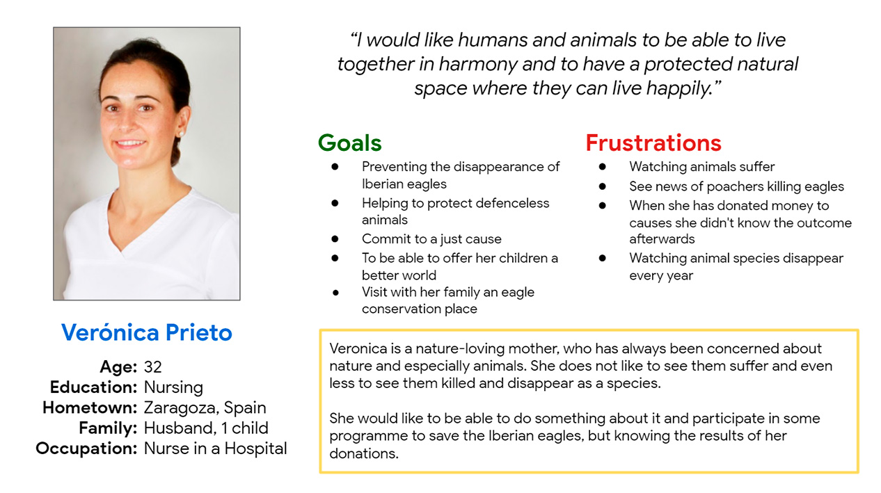
Persona: Verónica
Problem statement:
Verónica Prieto, is a 32-year-old woman, a nurse from Zaragoza, who would like animals and people to live in harmony, without the need for animals to suffer the consequences of our development. She would like to donate money to such a cause, but also to know what happens to it.
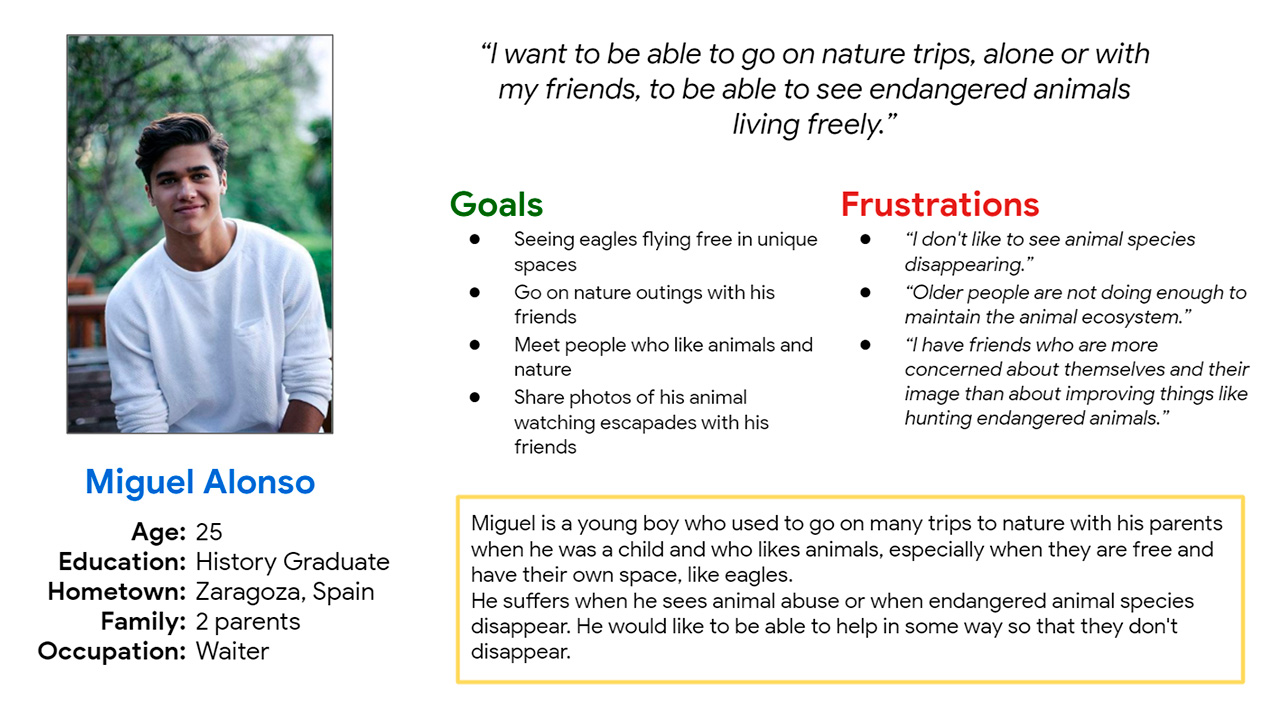
Persona: Miguel
Problem statement:
Miguel Alonso, a young man of 25 years old, who lives with his parents and works as a waiter, and who likes nature and nature-related travel, and seeing animals living freely and safely. His main frustrations are watching eagles become extinct year after year, seeing older people not doing enough for the environment and having friends who do not take nature conservation seriously
User Journey Map: Verónica
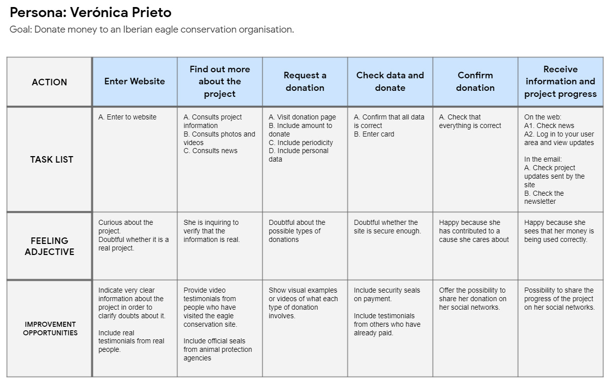
Veronica’s user journey mapping showed that it was important to show examples of information about the different types of donations that could be made, prior to making a donation.
User Journey Map: Miguel
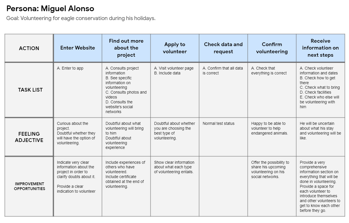
The mapping of Miguel’s user journey showed that it was important to show very clear information about what volunteering entailed, the different types and the experiences of other volunteers in the project.
Starting
the design
- Paper wireframes
- Digital wireframes
- Low-fidelity prototype
- Usability studies
Paper wireframes
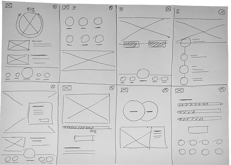
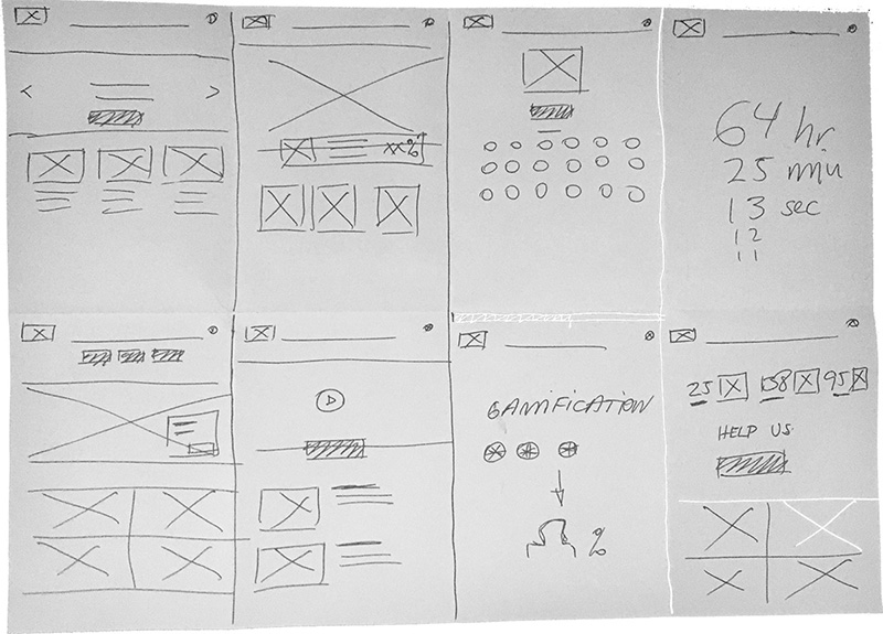
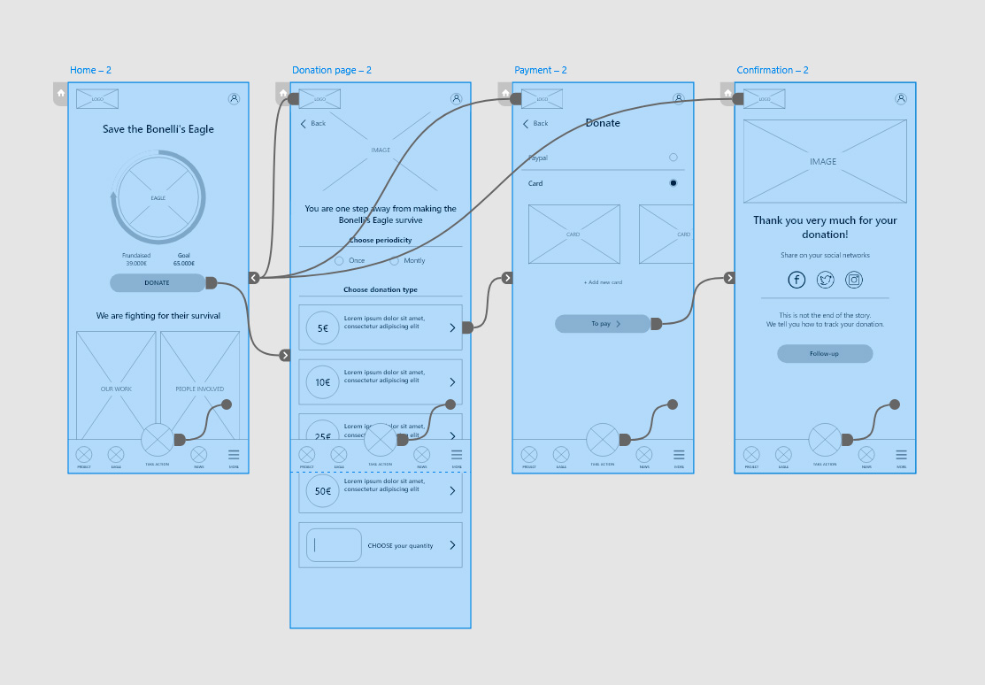
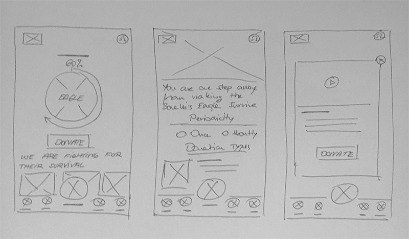
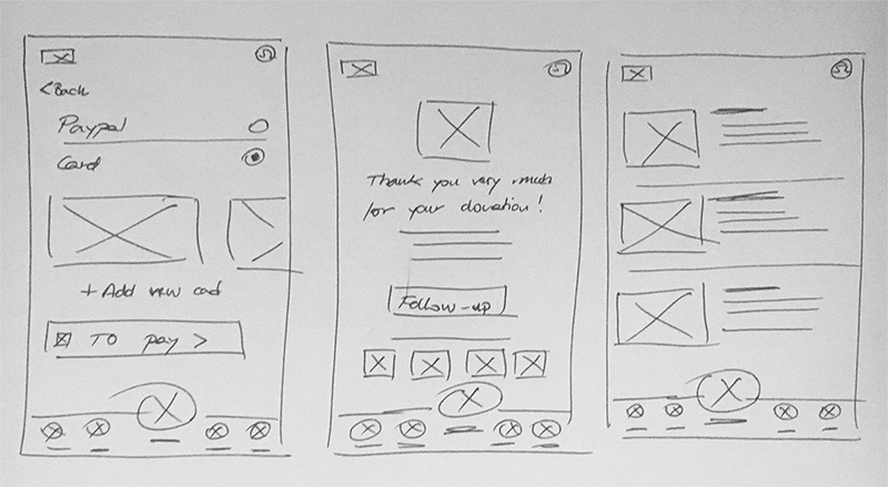
I also worked on the paper wireframes of the most important main flow, the donation flow.
Digital wireframes
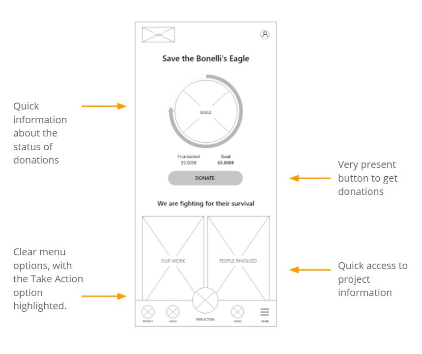
A first proposal was made for the Home of the app to show all the options available to find what users had indicated in the research phase.
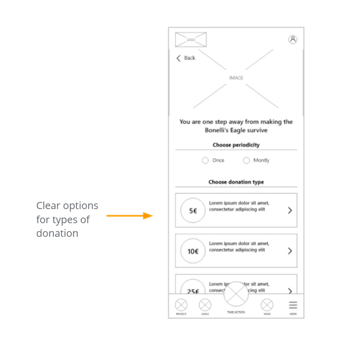
One of the main points raised by users was to know the different types of donations they could make. Work has been done to show these options very clearly on the donation screen.
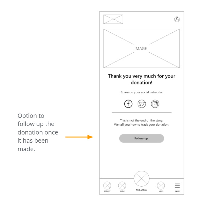
Another major concern of users was what happened after the donation was made. This indication from users has been taken into account, so that they can check and follow up.
Low-fidelity prototype
Usability study: parameters
Study type
Moderated usability study
Location
Spain, Zaragoza
Participants
5 participants
Lenght
25 – 30 minutes
Usability study: findings
Information
Users want to find out about the project before making a donation
Information
Users want to know more about the different types of donation and what they entail
Information
Users want to know how many people have already participated in donations before they donate
Clarity
Users want to be able to include their payment cards easily
Refining
the design
- Mockups
- High-fidelity prototype
- Accessibility
Mockups
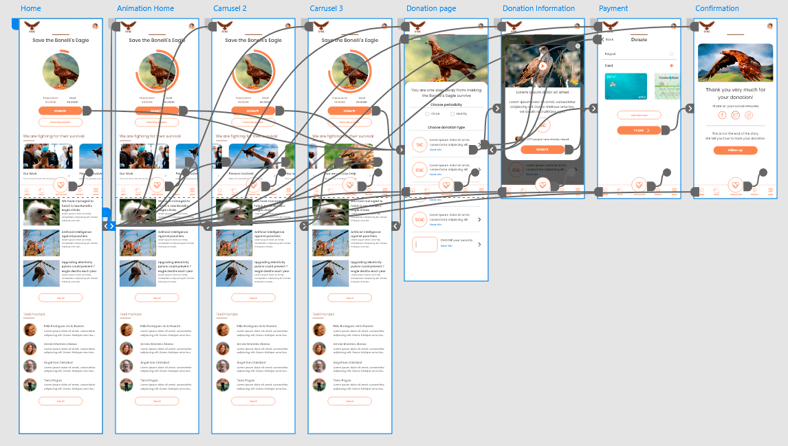
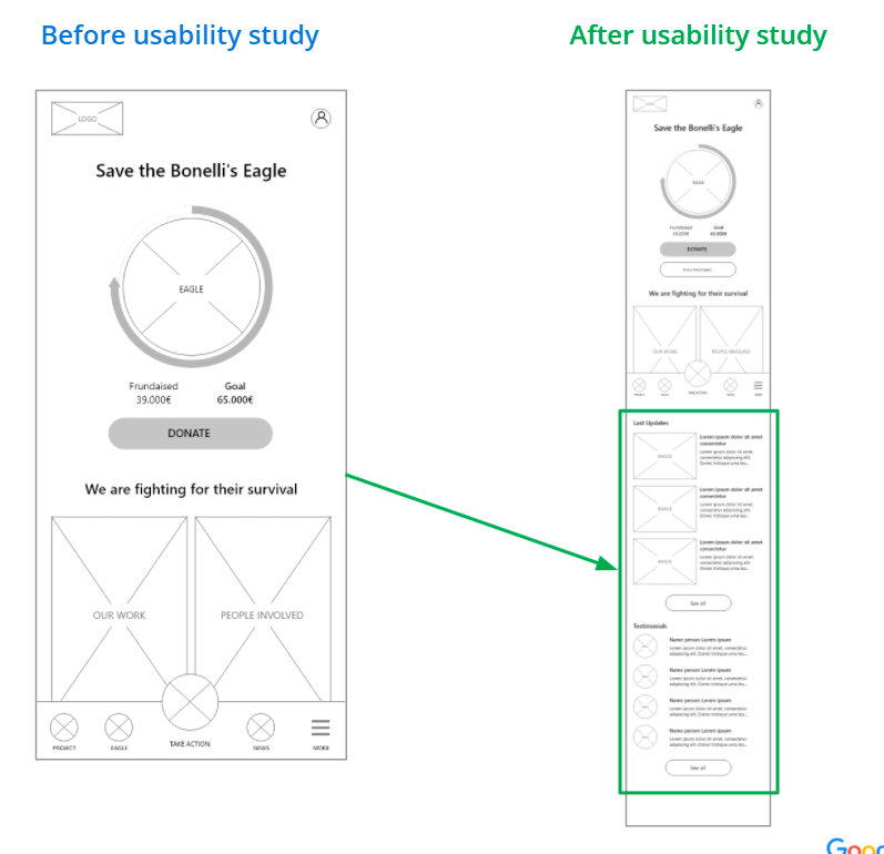
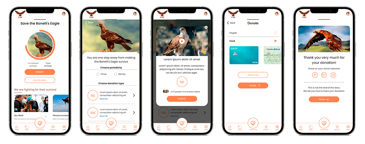
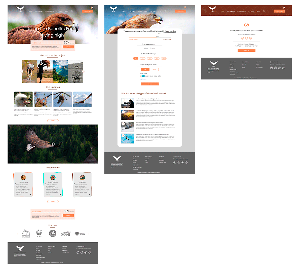
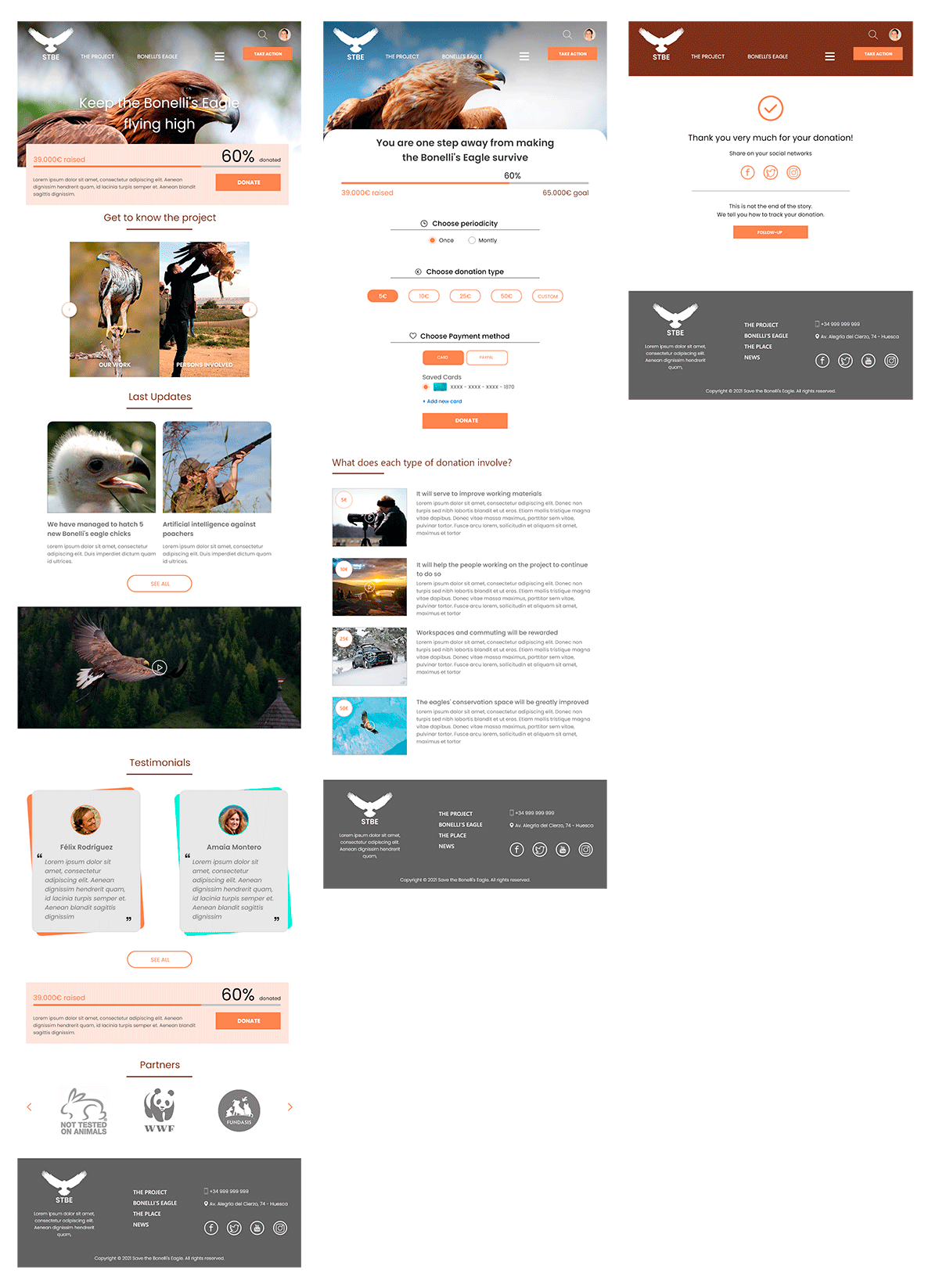
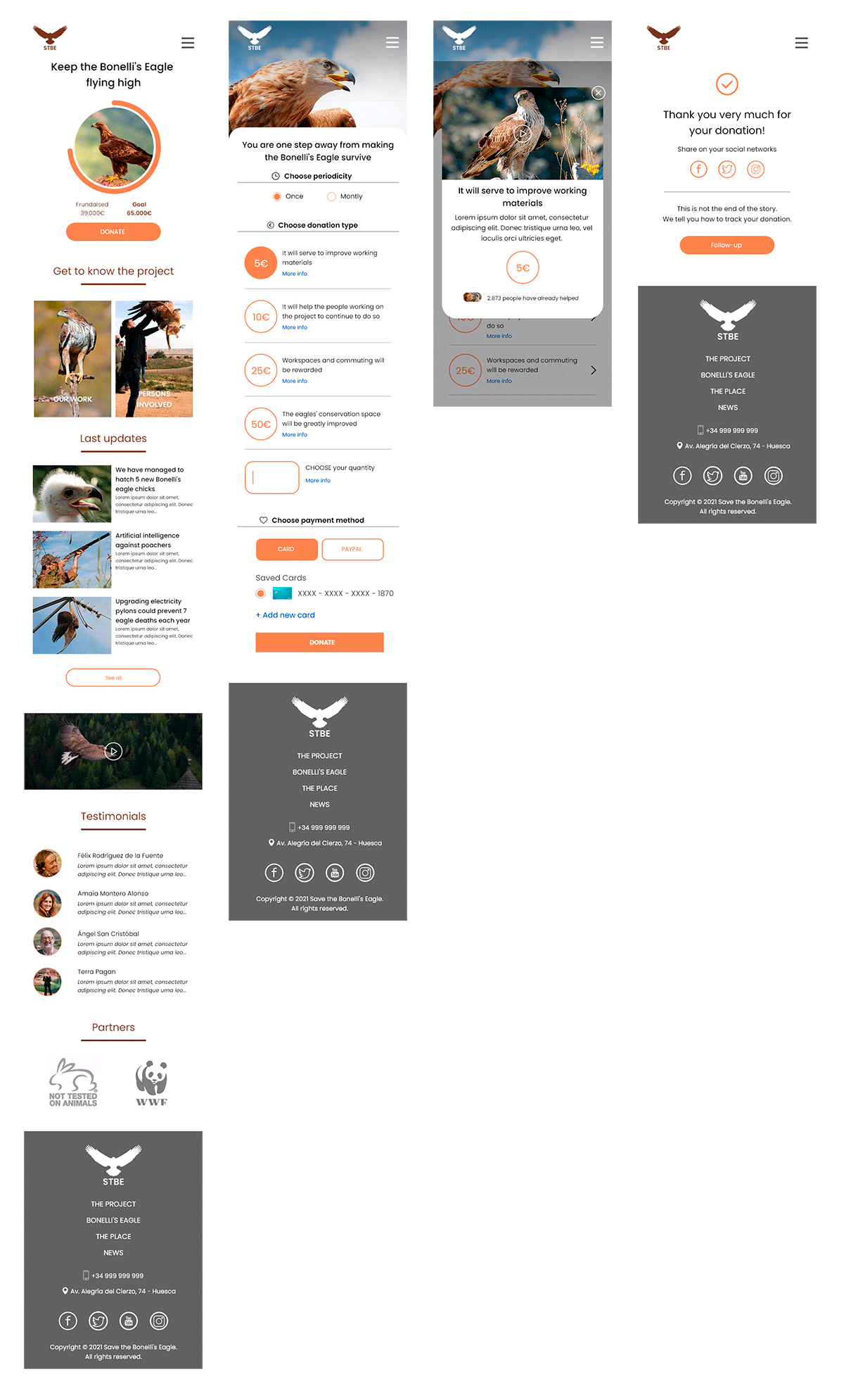
The usability studies showed that there was a need to improve the way users were informed about the project, as well as to include testimonials from other people who had already participated in some way in the project.
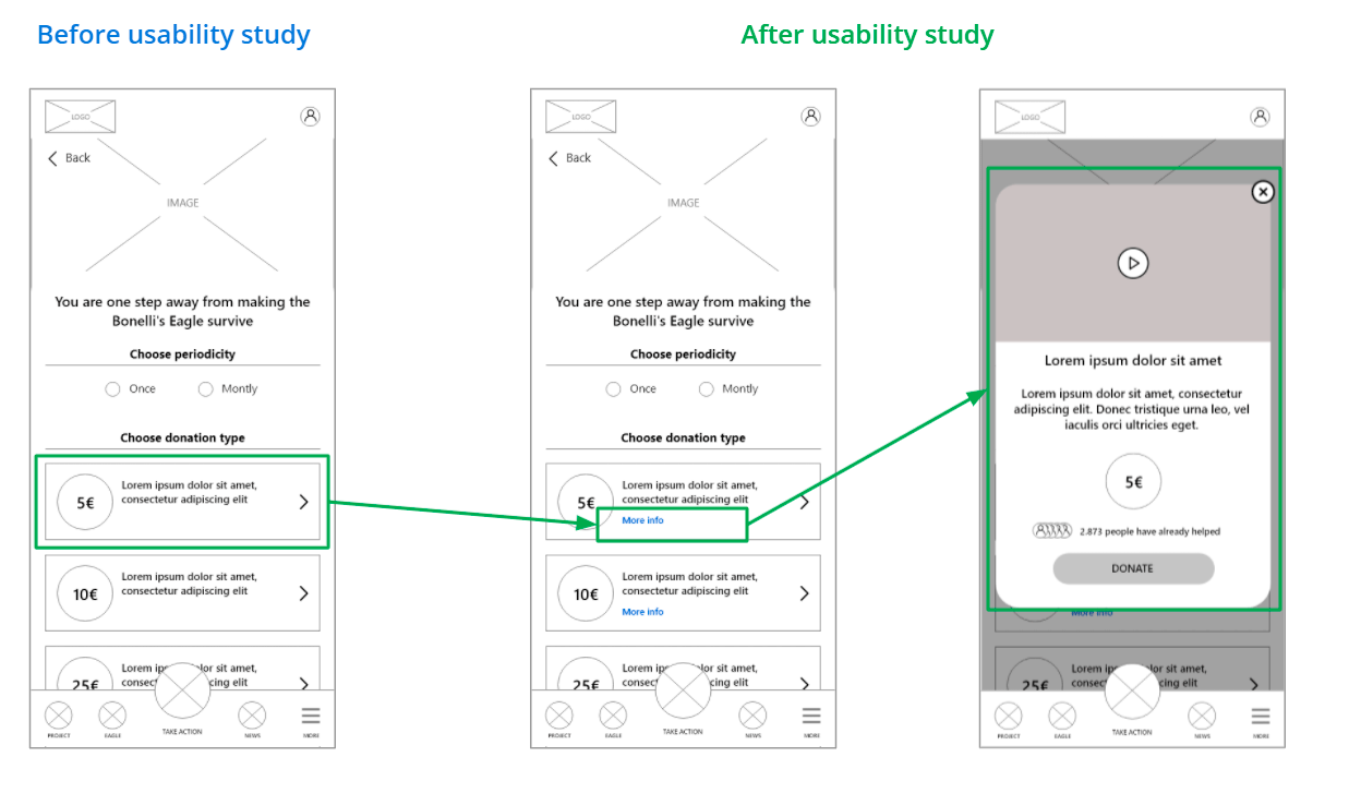
During the donation process, not only was the type informed, but a means to learn more about each one was included, with a screen offering more detailed information, as well as an explanatory video.
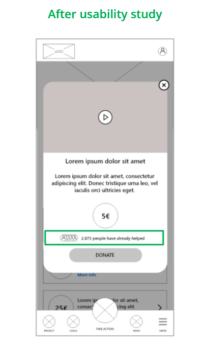
User feedback was taken into account to find out how many people had already made a donation. In this case, it was also included for each type, so that the user is even more informed.
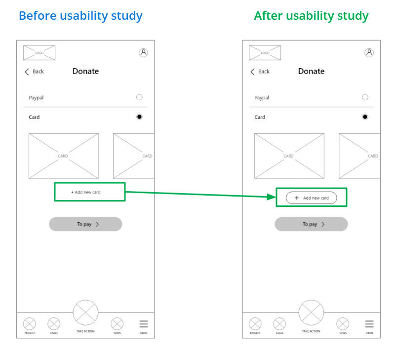
During the usability study, users did not notice the possibility of adding new cards to the payment mode. As a solution, a more prominent element with greater visual weight was proposed.
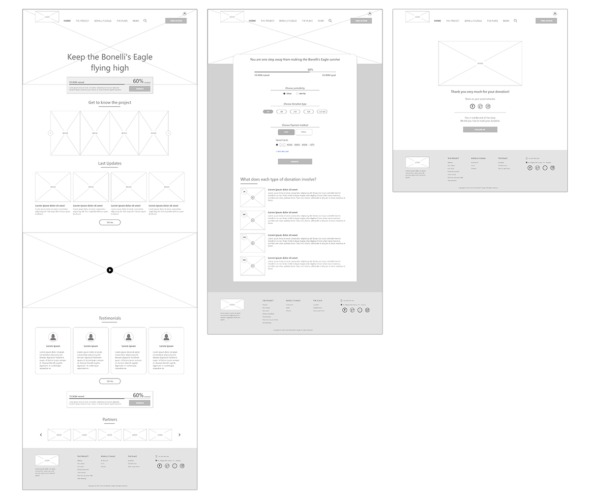
All the indications and improvements that were implemented in the app were also taken into account for the Responsive version of the website. The wireframes are included below.
Key Mockups
App
Desktop
Tablet
Smartphone
Accessibility considerations
Clear fonts have been used to facilitate on-screen reading of the information
The contrasts of the screen elements have been worked on to make them easily legible for users
Iconography was used together with accompanying text to facilitate understanding
Going forward
- Takeaways
- Next steps
Takeaways
Impact:
A quote from user comments:
“I have supported different animal charities before, but none of them have given me the opportunity to be able to follow up my donation in a personalised way. I am really excited to be able to use the STBE app and website.”.
What I learned:
Next Steps
Conduct another round of usability studies, but in this case unmoderated, to include more users and to assess whether there are still any elements of the interface that need improvement
Send satisfaction and NPS surveys when the app has gone into production and is being used
Let’s connect!
Email: hola@davidgilripoll.com

