Project Overview
The product:
Paolo’s Restaurant is a local family-run Italian restaurant that has been offering innovative menus and dishes for 10 years. Now they want to enter the online world by not only offering their current menu service, but also offering their customers the option to order personalised dishes with online delivery. They are mainly targeting individuals or families who want to eat at home, as well as workers who do not have time to prepare their daily meals.
Project duration:
During April 2021
The problem:
People who want to try customised Italian dishes but don’t know how to make them.
Workers who want to eat healthy homemade Italian food but do not have time to prepare it for their daily work.
The goal:
Design an application for Paolo’s Restaurant that allows users not only to order dishes from the menu, but also to order personalised dishes with ingredients and have them delivered to their home or work.
My role:
UX designer designing an app for Paolo’s Restaurant from conception to delivery.
Responsibilities:
Conducting interviews, paper and digital wireframing, low and high-fidelity prototyping, conducting usability studies, accounting for accessibility, and iterating on designs.
Understanding
the user
- User research
- Personas
- Problem statements
- User journey maps
User research: summary
During the research phase, I conducted interviews with people similar to target audience and created an empathy map to understand their needs. This research showed that the main concerns of the users were that although they loved italian food and knew what they liked, they were not able to prepare it properly.
And these users, whether families, couples or single people, would love to have an option in their city to order this type of italian food.
In addition, many of them did not have enough time during their working days to be able to prepare the next day’s meal or even at the weekend.
User research: pain points
Knowledge
People do not know how to prepare Italian dishes correctly
Functionality
No app in the city provides the option to order personalized dishes
Time
Many users do not have time and prefer to order Italian food for home delivery or for work.
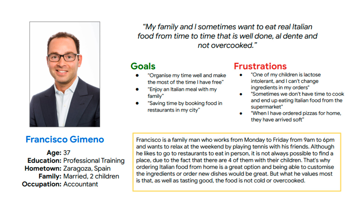
Persona: Francisco
Problem statement:
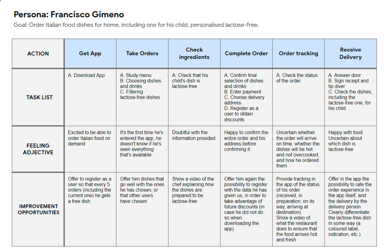
Francisco is a father who does not have much free time to cook and prefers to eat good Italian food, especially for his lactose intolerant son, because it is very important for him to be able to personalise his dishes.
Persona: Leticia
Problem statement:
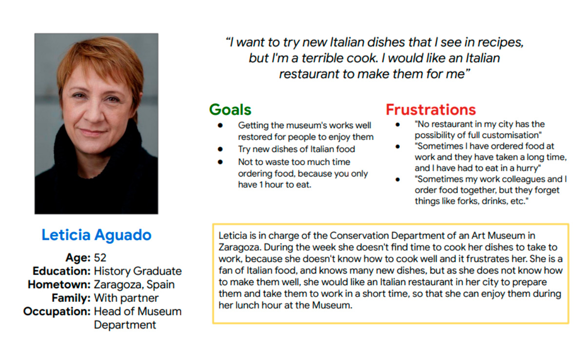
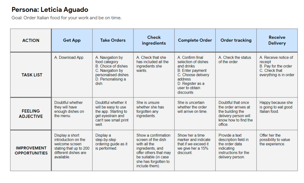
Leticia is a museum worker who has no time to cook and prefers to order food every day for her office because she would love to be able to order dishes customised to her taste.
User Journey Map: Francisco
Francisco’s user journey mapping showed that it was important to show the details of the ingredients of the different dishes, and that this was a desired functionality.
User Journey Map: Leticia
Leticia’s user journey mapping showed that we had to give importance to set delivery times, for people who work and have little time to eat.
Starting
the design
- Paper wireframes
- Digital wireframes
- Low-fidelity prototype
- Usability studies
Paper wireframes
I worked on paper wireframes for the main access screen, the Home, the critical moment of choice and navigation. I made 5-page proposals for the Home App and ended up with a tight final version that brought out the best in everyone.
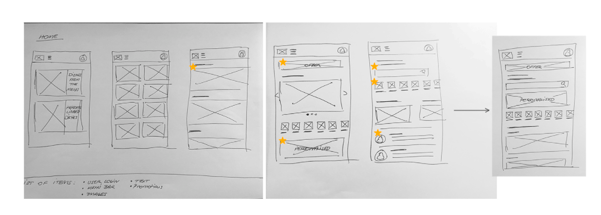
Stars were used to mark the elements of each sketch that would be used in the initial digital wireframes.
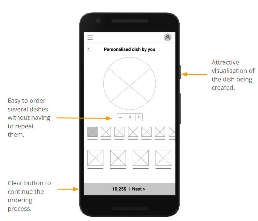
Work was done on paper wireframes for one of the app’s core processes, the ordering of a personalised dish, a critical functionality of the app that would set it apart from its competitors.

Stars were used to mark the elements of each sketch that would be used in the initial digital wireframes.
Digital wireframes
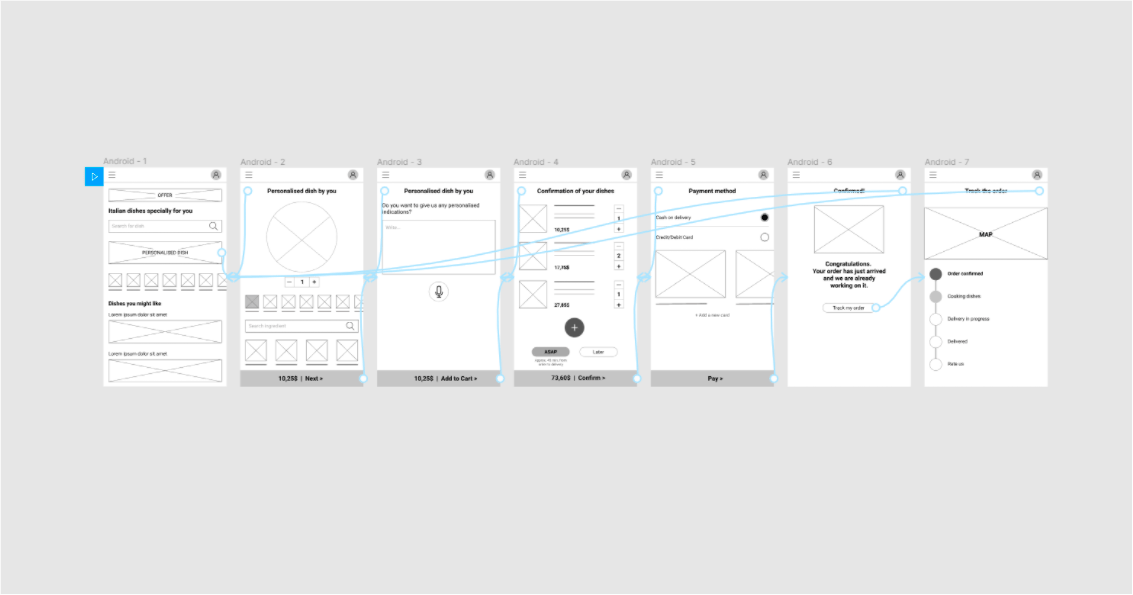
A first proposal was made for the Home of the app to show all the options available to find what users had indicated in the research phase.
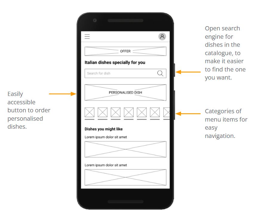
One of the main points raised by users was to be able to find what they were looking for without too much difficulty. I have worked on a navigation through different paths to meet the need.
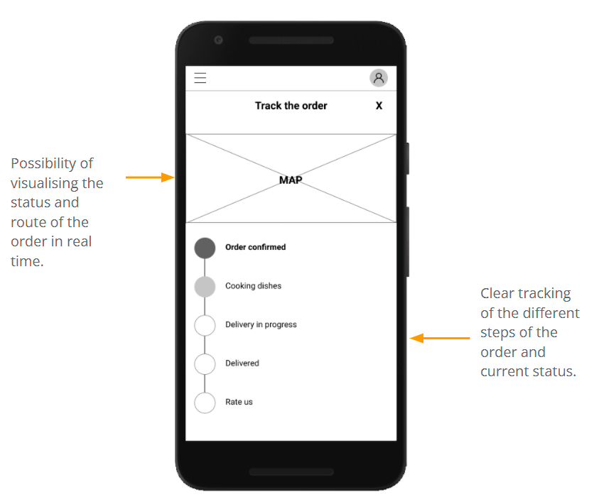
Another major concern for users was what happened after the order was placed and whether it would arrive on time. An order tracking screen has been developed to keep track of the status of the order at all times.
Low-fidelity prototype
Usability study: parameters
Study type
Moderated usability study
Location
Spain, Zaragoza
Participants
5 participants
Lenght
25 – 30 minutes
Usability study: findings
Efficiency
People want to find dishes and ingredients quickly and easily
Efficiency
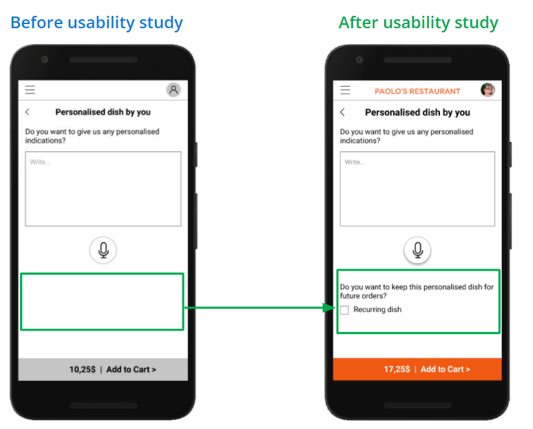
People want to be able to save their created personalised dish as a favourite, so that they don’t have to repeat it
Clarity
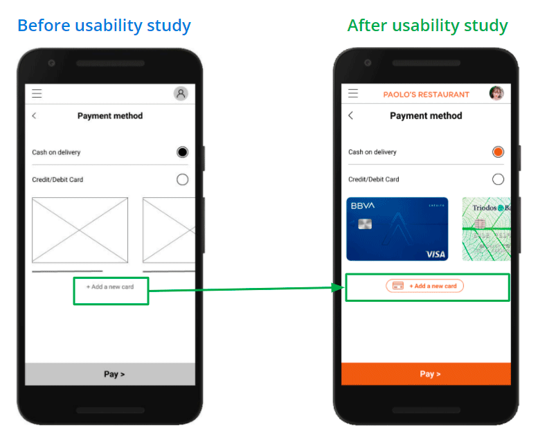
Users want to be able to include their payment cards easily
Refining
the design
- Mockups
- High-fidelity prototype
- Accessibility
Mockups
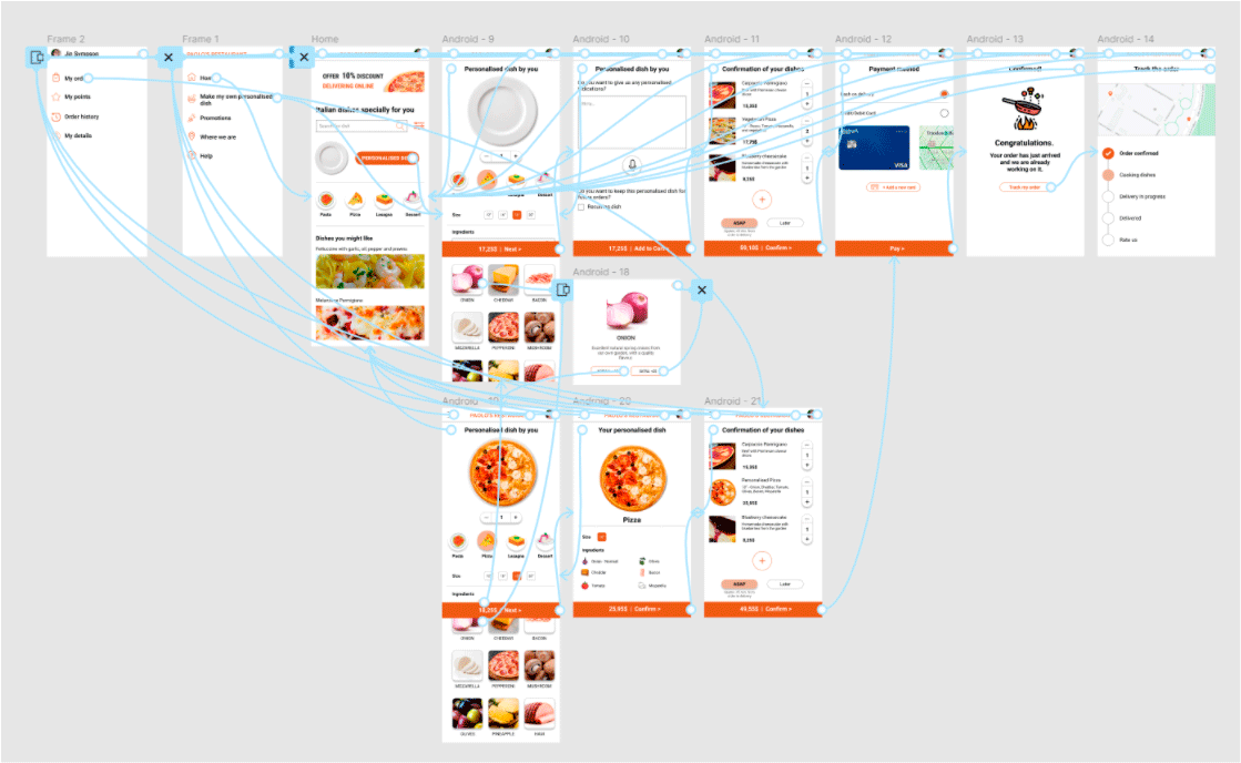
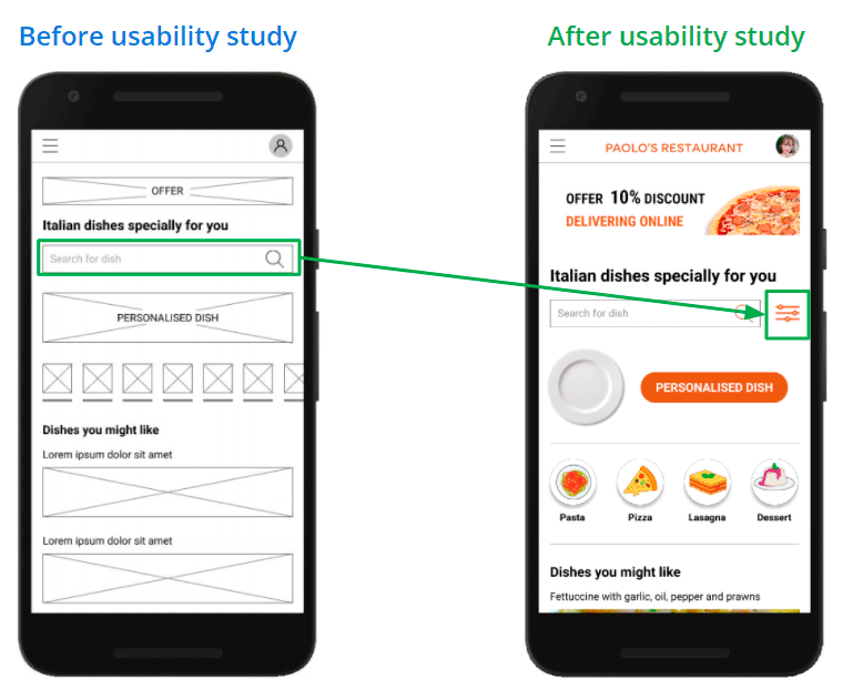
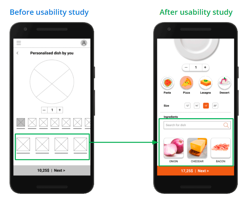
The usability studies made me realise that the way of filtering and finding dishes during the navigation and also with the ingredients during the process of creating the personalised dish had to be improved.
And here with the improvement of the search for specific ingredients during the creation of the personalised dish.
The first designs did not allow saving the creation of the personalised dish for other times. After the usability study, this functionality was incorporated to improve the experience.
During the usability study, users did not notice the possibility of adding new cards to the payment mode. As a solution, a more prominent element with greater visual weight was proposed.
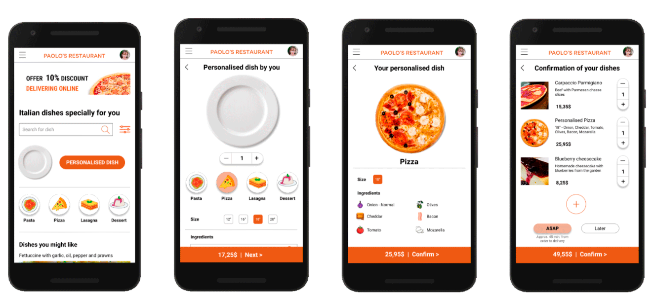
Key Mockups
Accessibility considerations
Clear fonts have been used to facilitate on-screen reading of the information
The contrasts of the screen elements have been worked on to make them easily legible for users
Iconography was used together with accompanying text to facilitate understanding
A voice typing function has been added for the detail description field on the personalised plate for the visually impaired
Going forward
- Takeaways
- Next steps
Takeaways
Impact:
The app makes users feel that Paolo’s Restaurant App can meet their Italian food needs.
A quote from user comments:
“Really, being able to order a personalised dish in such a simple and visual way will make me repeat when I use it. Finally someone has thought of what I needed”.
What I learned:
While designing Paolo’s application, I learned that including users in the design process really adds full value to the user experience it will offer to all users who use it.
Next Steps
Conduct another round of usability studies, but in this case unmoderated, to include more users and to assess whether there are still any elements of the interface that need improvement
Send satisfaction and NPS surveys when the app has gone into production and is being used
Let’s connect!
Thank you for your time reviewing my work on the Paolo’s Restaurant app! If you’d like to see more or get in touch,
my contact information is provided below.
Email: hola@davidgilripoll.com

