Project Overview
The product:
Project duration:
During May 2021
The problem:
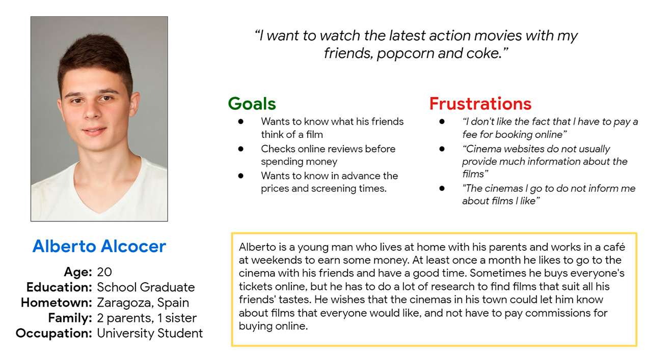
Users who are regulars at the cinema want to be able to take advantage of some type of loyalty or offers, especially when they buy their tickets online, without having to pay commissions.
The goal:
Design a responsive website for the Palafox Cinema that allows users to buy their tickets easily and quickly on any device and obtain advantages for it.
My role:
Responsibilities:
Conducting interviews, paper and digital wireframing, low and high-fidelity prototyping, conducting usability studies, accounting for accessibility, and iterating on designs.
Understanding
the user
- User research
- Personas
- Problem statements
- User journey maps
User research: summary
During the research phase, I conducted interviews with people similar to the target audience and created an empathy map to understand their needs. This research showed that the main concerns of users were that they were often looking for movies to go to the cinema away from home with their mobiles, but being able to buy them online was complicated, especially in terms of seat selection.
These users would also like the cinema to have an option to register and personalise alerts based on their personal preferences, and for the cinema to alert them when there are films that match their predilection.
User research: pain points
Process
Users find the process of buying cinema tickets by mobile phone complicated
Functionality
There is no system of film alerts according to users’ preferences

Process
Concerns about the cinema entry process with digital tickets.
Persona: Alberto
Problem statement:
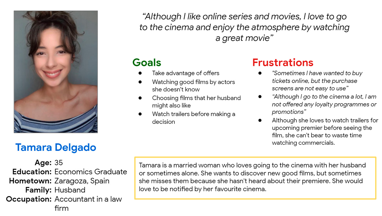
Persona: Tamara
Problem statement:
Tamara is a busy person who needs to know about upcoming premieres because she doesn´t miss out on possible good films.
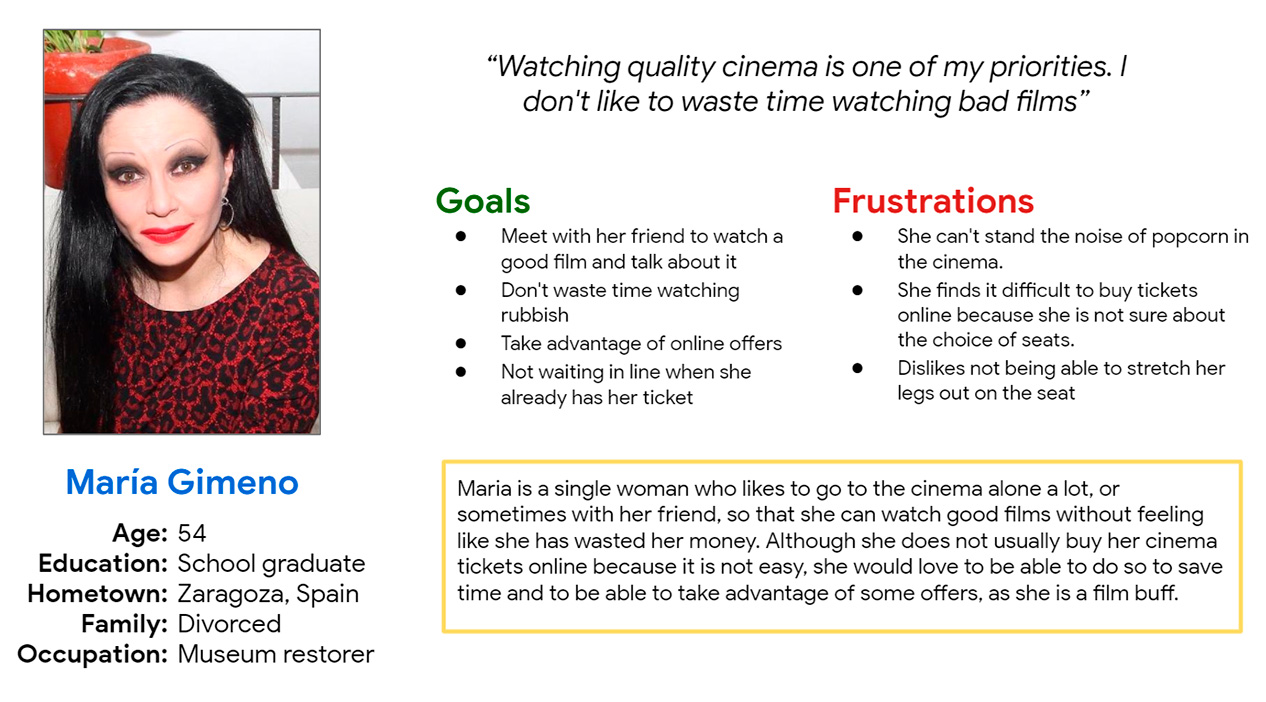
Persona: María
Problem statement:
María is a person who is not used to shopping online who needs a website so be easy to use because she wants to be able to shop online and save time doing so.
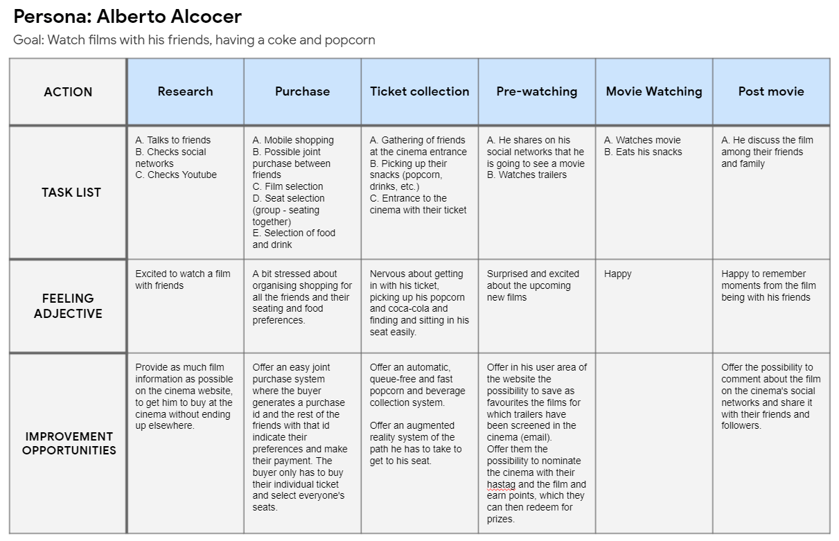
User Journey Map: Alberto
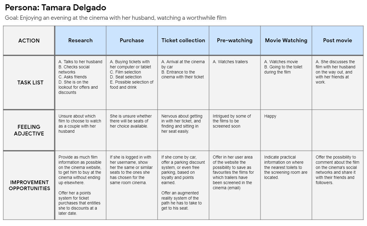
User Journey Map: Tamara
The mapping of Tamara’s user journey showed that we should give importance to a points progression system that facilitates the choice of film with discounts earned with those points, and builds loyalty in the future.
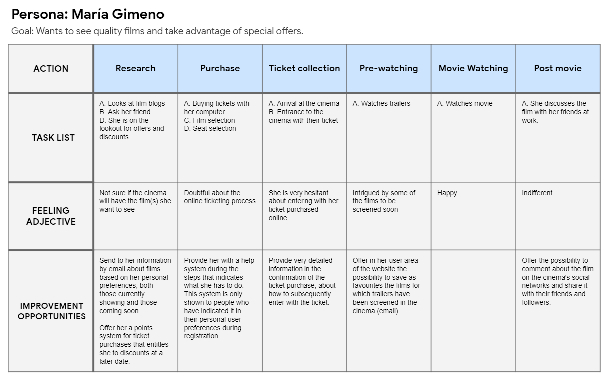
User Journey Map: María
Maria’s user journey mapping showed that it was important for her to be able to choose quality films and enjoy them in the cinema without distractions from other users, as well as to be able to enter the cinema smoothly with a ticket purchased online.
Starting
the design
- Paper wireframes
- Digital wireframes
- Low-fidelity prototype
- Usability studies
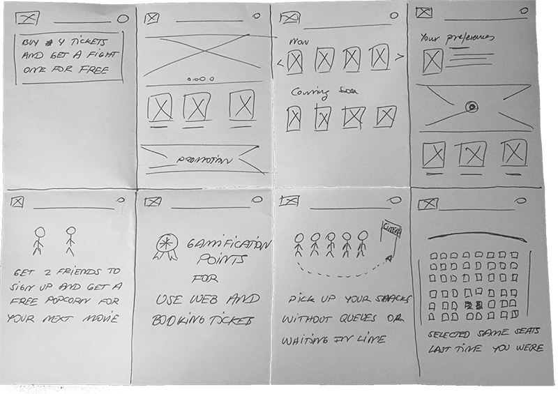
Paper wireframes

Digital wireframes
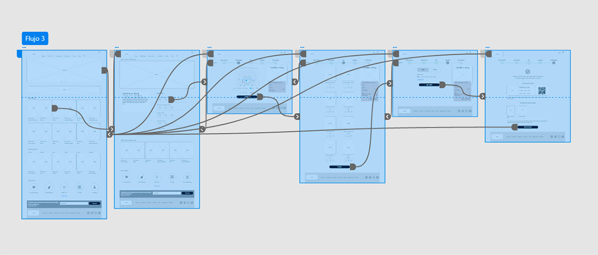
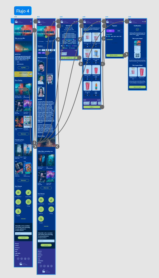
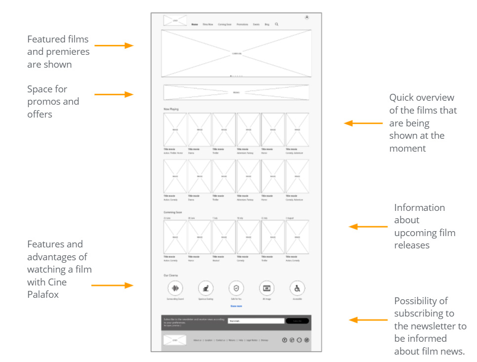
The majority of users who would buy cinema tickets would do so online. Thus, the main wireframes of the process were first developed for desktop and then adapted for smartphones, taking into account their idiosyncrasies.
A first proposal was made so that the Home page of the website would show the most important information in the users’ decision about which film to see.
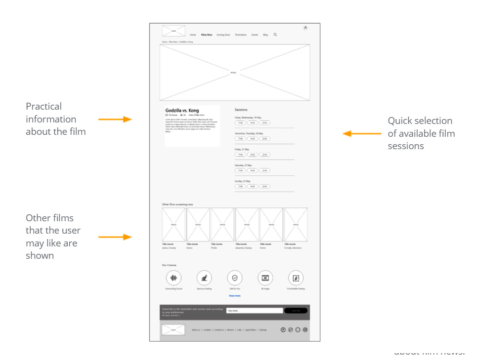
The page of the film file, from the purchase flow, was then developed.
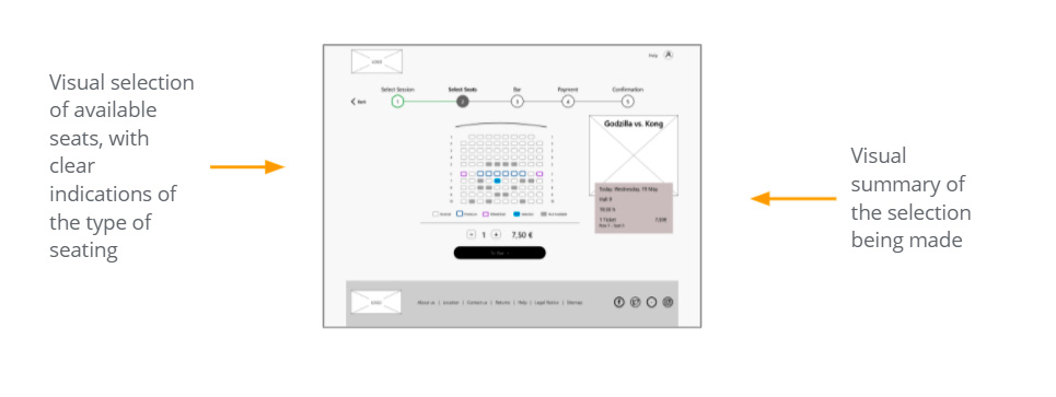
Low-fidelity prototype
Usability study: parameters
Study type
Moderated usability study
Location
Spain, Zaragoza
Participants
5 participants
Lenght
25 – 30 minutes
Usability study: findings
Information
Users want to be shown films personalised to their preferences
Functionality
Users want to be able to bookmark films that they might watch at a later date
Information
Users want to have more information about the film they want to see, before buying tickets
Clarity
Users want to know how they will pick up their snacks at the cinema, before buying them online
Refining
the design
- Mockups
- High-fidelity prototype
- Accessibility
Mockups
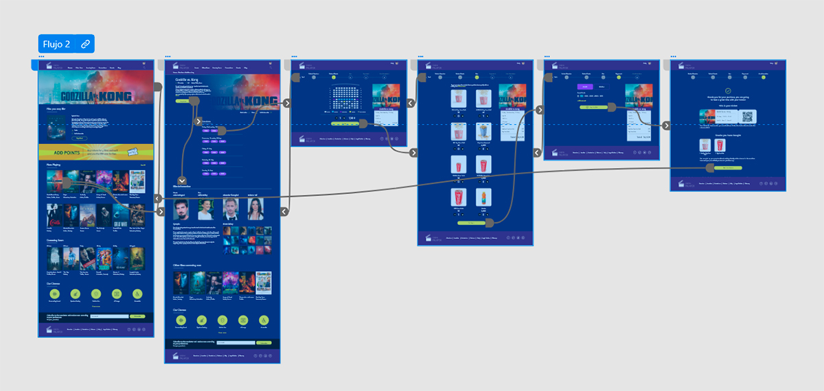
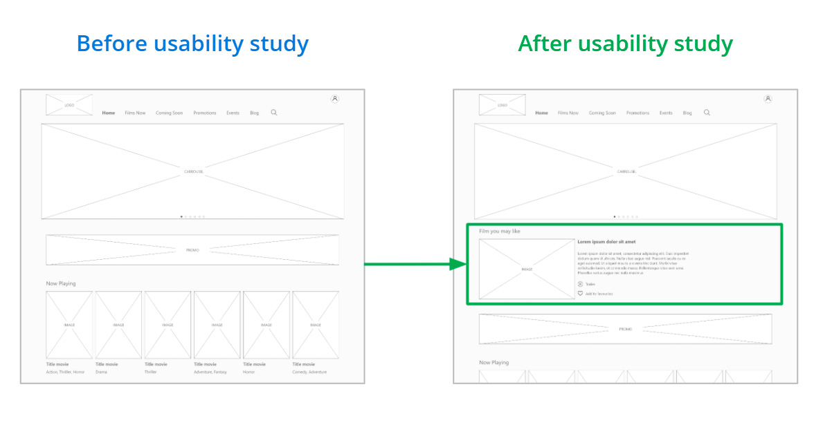
The usability study made me realise that the information given to users about films according to user preferences needed to be improved.
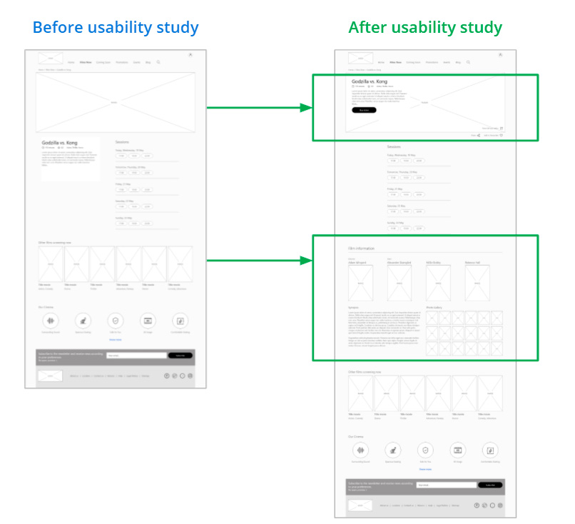
The film page was redesigned to show more information about the film, including the director, main actors, photos and the full review, so that users can have more information before choosing a session.
We also included functionalities requested by users, such as watching the trailer, being able to save it as a favourite, and we also included the possibility of sharing the film file, both on social networks and by email, something that can happen when you want to send it to an acquaintance.
Key Mockups
Desktop
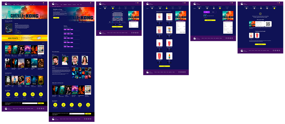
Mobile
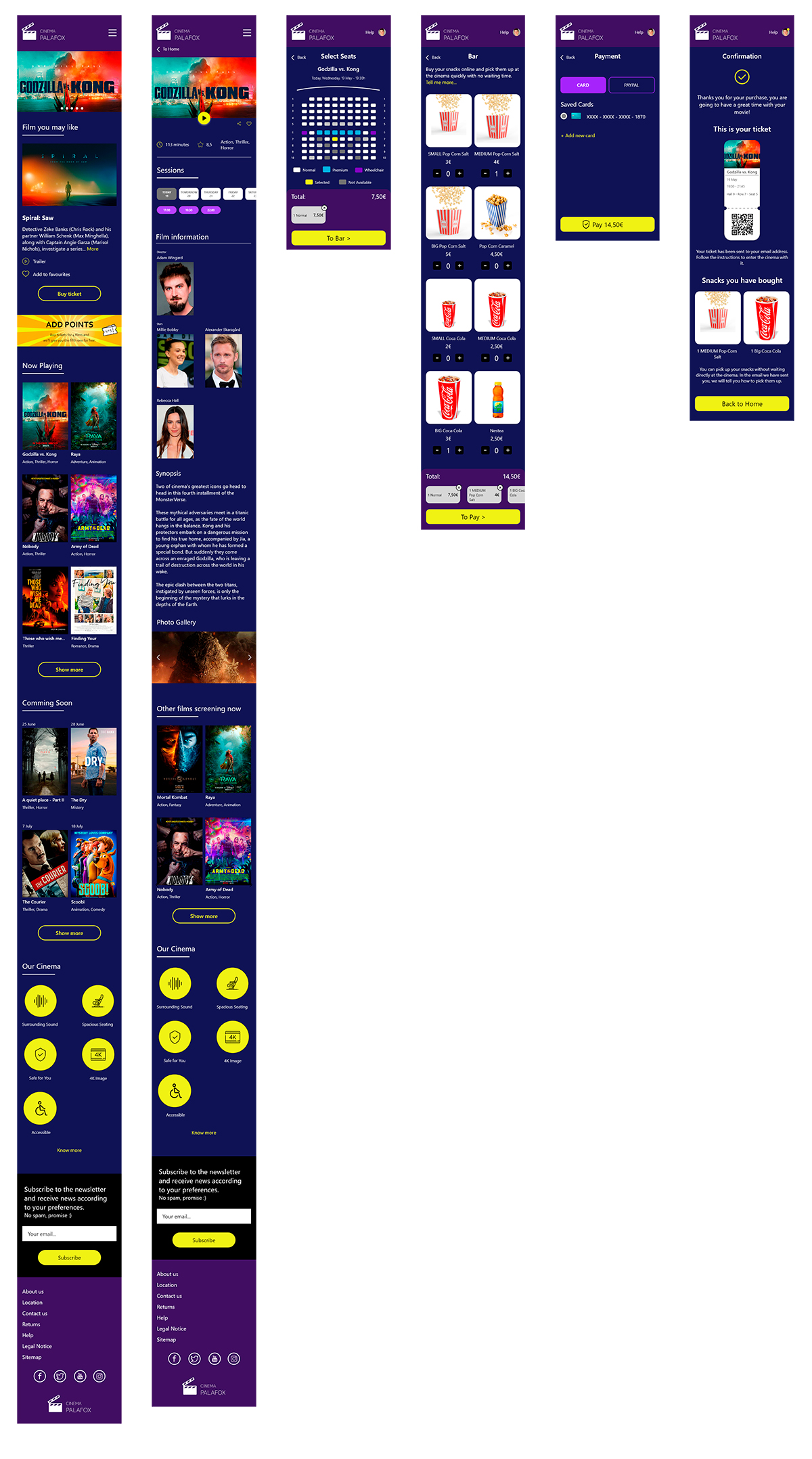
Clear fonts have been used to facilitate on-screen reading of the information
The contrasts of the screen elements have been worked on to make them easily legible for users
Iconography was used together with accompanying text to facilitate understanding
Going forward
- Takeaways
- Next steps
Takeaways
Impact:
The ease implemented in the process of booking cinema tickets has made users feel that the new Cine Palafox website can satisfy their needs when it comes to choosing a good film to watch and being able to buy it.
A quote from user comments:
“The fact that I know I have a Cinema that is not only going to make it easy and quick to be able to buy tickets, but also alert me to new releases that really interest me, will make me use your website on a regular basis.”.
What I learned:
Next Steps
Conduct another round of usability studies, but in this case unmoderated, to include more users and to assess whether there are still any elements of the interface that need improvement
Send satisfaction and NPS surveys when the app has gone into production and is being used
Let’s connect!
Thank you for your time reviewing my work on the Paolo’s Restaurant app! If you’d like to see more or get in touch,
my contact information is provided below.
Email: hola@davidgilripoll.com

